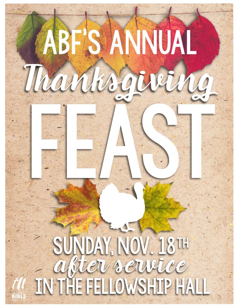
2 different flyers for the same event. The original (with the black text) was rejected by the higher-ups so I tried with a fresh design.
Hindsight Critiques
On the original:
The background is really distracting. Information is only divided by alternating text, blah. It’s too busy and kind of hard to read.
On take 2:
Definitely better. Not in love with the ‘fancy’ font choice or how the important info is laid out, but it’s a way better visual and a lot easier to read.