Three versions of a flyer I made for a raffle.
Hindsight Critiques:
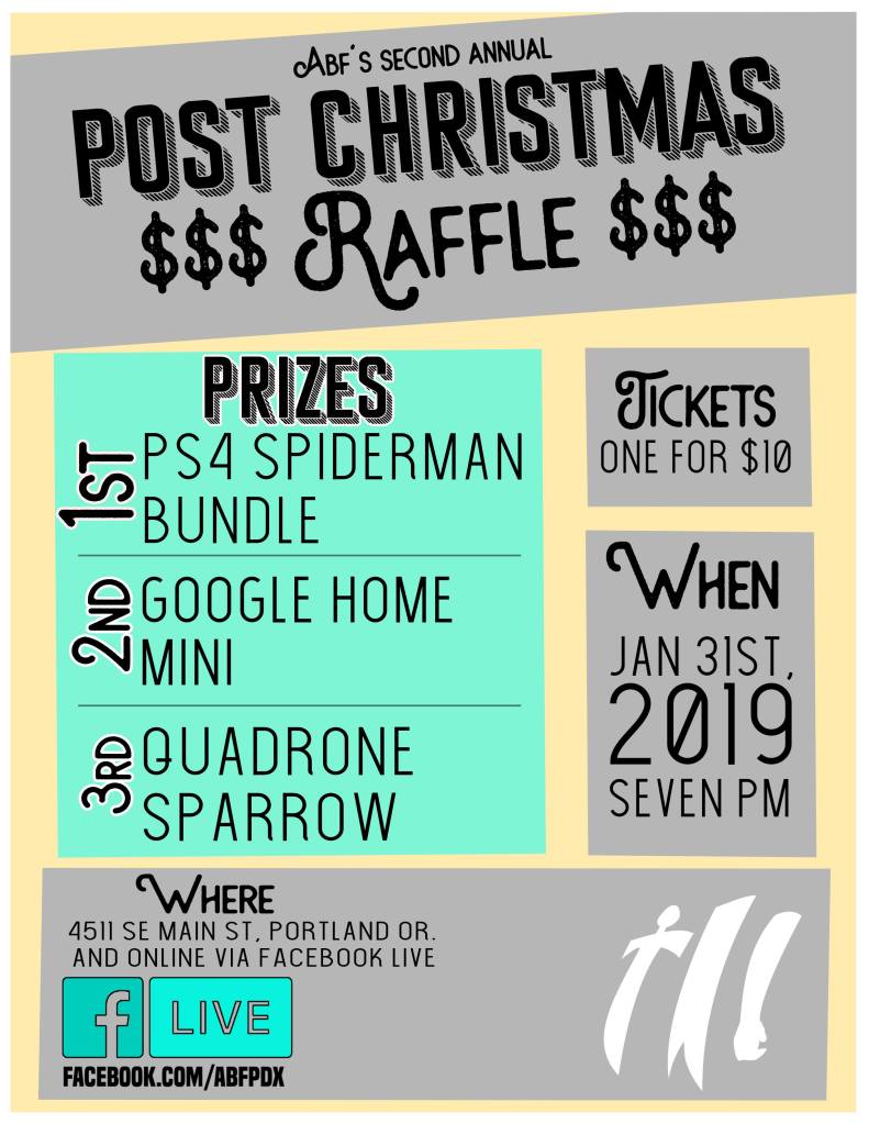
First attempt:
WHAT IS HAPPENING HERE????? I am not sure where to start. I get the raffle tickets as section headers but the idea is poorly done and there’s no real theme other than that. The background color is atrocious… what color is it? flesh? It’s honestly gross. It’s probably one of the worst things I have ever designed. Yuck.
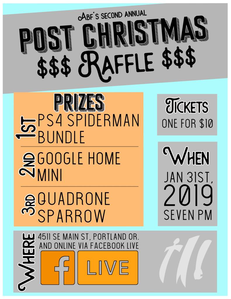
Second attempt:
This is… maybe a little better? I obviously have not figured out color schemes by this point. I don’t like the font combo and the dollar signs…. why? The division of information makes more sense… but the boxes are gross. Again… the color combo is terrible. Yuck
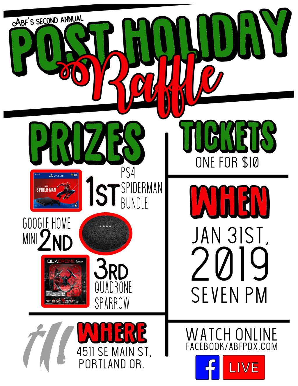
Third attempt:
I had assistance making this. It’s a huge improvement from the first two. Colors evoke the right season, it’s not super boxy and feels cohesive. It’s not really my style though, the colors are too bright for me.