
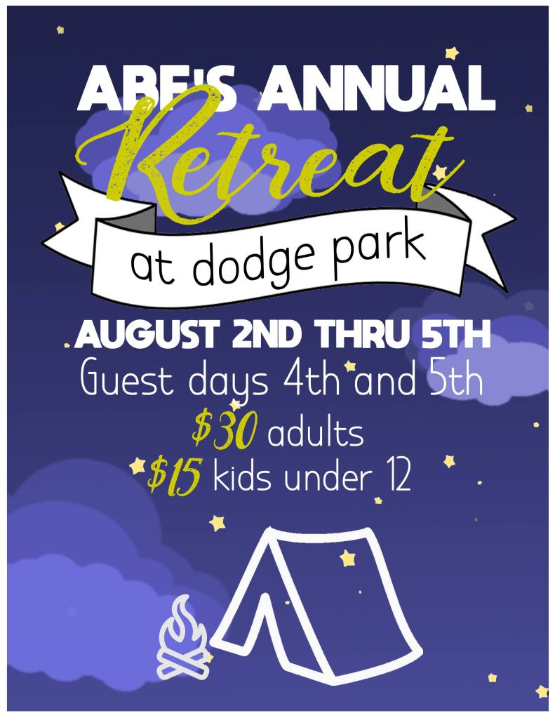
A church retreat flyer.
Hindsight Critiques:
When I first made this flyer I was SUPER impressed with myself. It’s a cute idea that evolved from an idea focused around a campsite looking up at the stars. I still think it’s cute, the fonts are good.
First thing. I HATE the weird chartreuse color of the word ‘Retreat’. I was going for yellow, but not too yellow and missed completely. I would fix the yellow.
Second, this could really use drop shadows in some places, particularly the banner. I also feel now that while it’s cute, the banner doesn’t really serve the theme. I’d also probably make it smaller and put it to the side a little.
Third, I have grown to hate this type of grouping information. It’s an improvement from my alternating font days, but it’s not super clear and honestly, it’s kinda boring to me. Not the most efficient way either.
The last thing, the background is just downloaded from the internet, as is anything that’s not text. It works, but as a preference, I like to make my own assets now, but that’s a more recent development as I’ve gained both the experience and the tools to make my own. If I remade this flyer it would have a custom background and other assets.
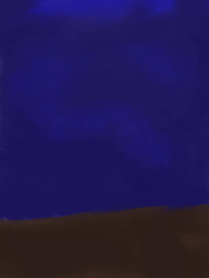
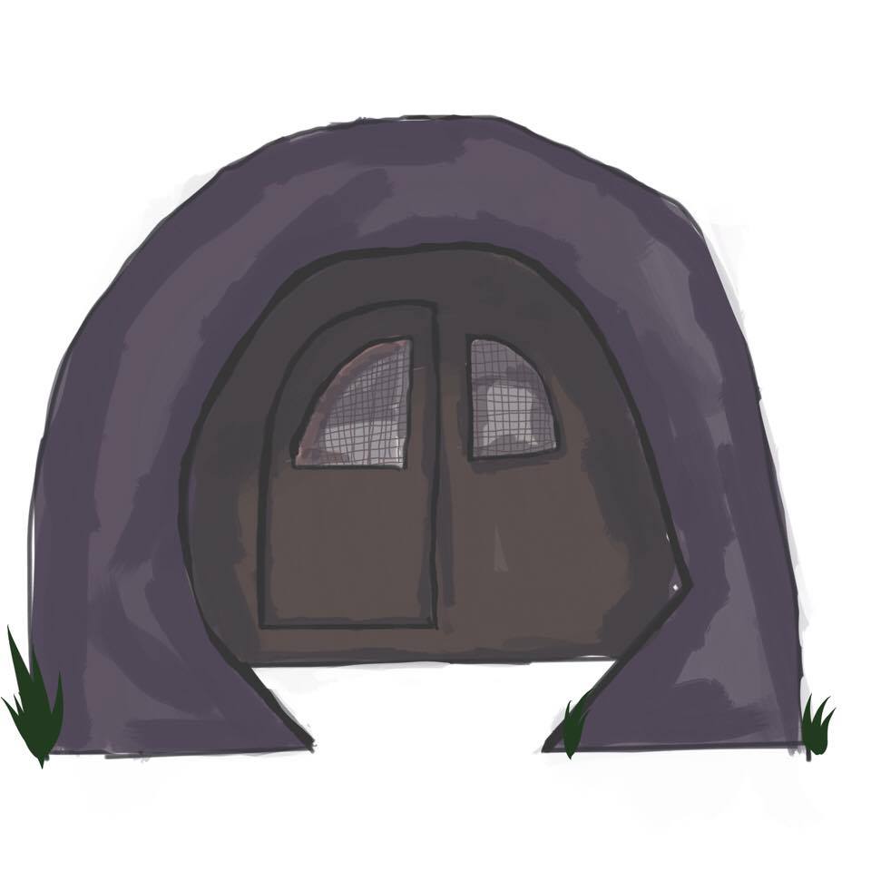
UPDATE:
I tried to make assets for my original vision, but it didn’t look right… here they are…


One response to “Church Retreat ’19 / Graphic Design”
is that a hobbit hole?
LikeLike