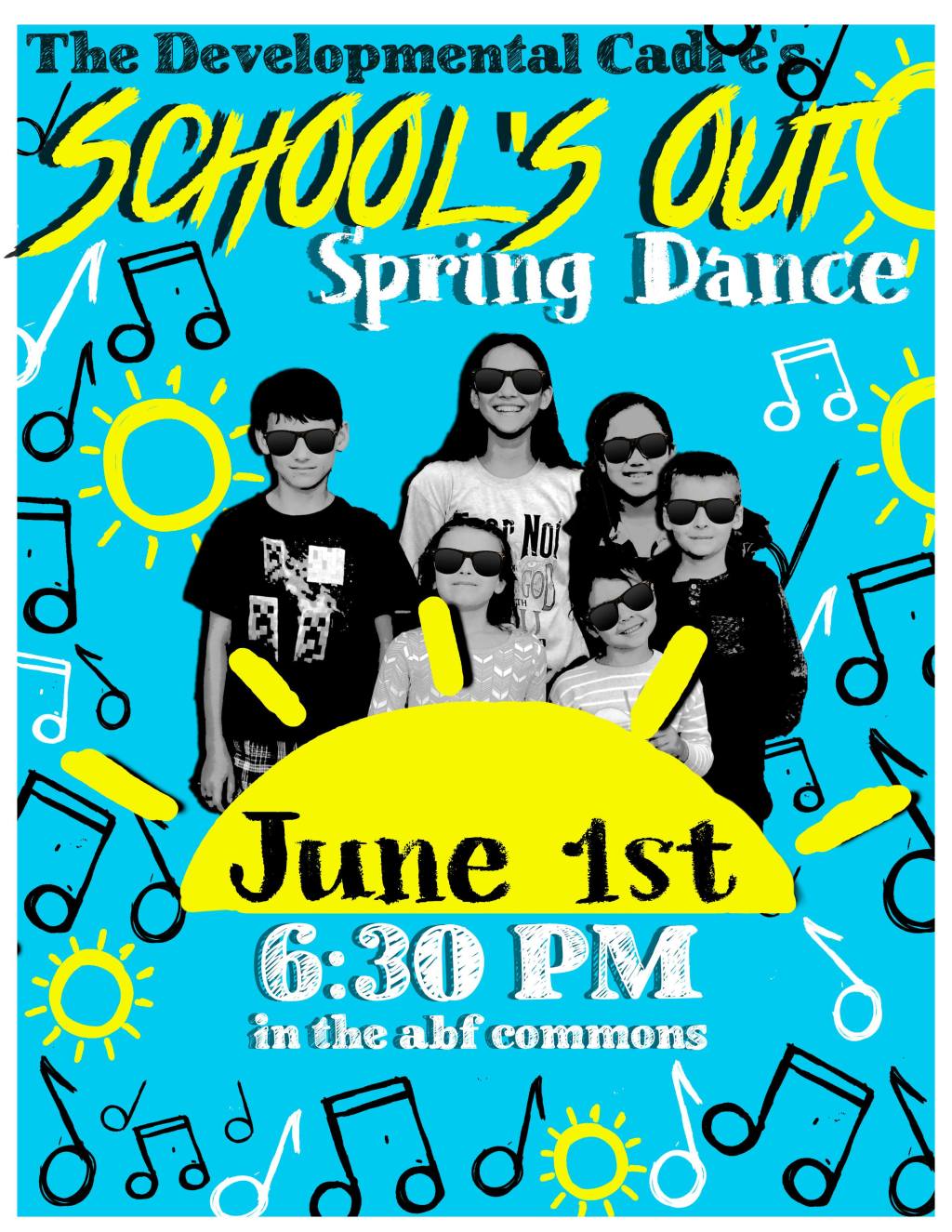
This was the first flyers I designed assets for. I was looking for pngs with a sketchy handmade vibe and couldn’t find any. I made music notes and suns on my 7.9in Ipad mini in Procreate. I see continued improvement in this flyer in vision and execution, but let’s get on to the design critiques.
Design Critiques:
Right off the bat, the alignment kinda sucks. The title section needs to be moved down and one of the words is obscured by a music note. I am pretty okay with all the fonts, but the sketchy pencilish one is on the border of working and not working for this. This was a dance for the school kids, so everything was supposed to look messy and bright, but in some aspects, it’s too messy. A sun and “School’s Out” are the same color and too close. I am weirded out by the lack of drop shadow in some places.


