-

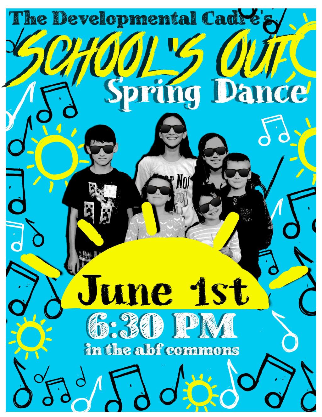
Spring Dance ’19? / Graphic Design
Read more: Spring Dance ’19? / Graphic DesignThis was the first flyers I designed assets for. I was looking for pngs with a sketchy handmade vibe and couldn’t find any. I made music notes and suns on my 7.9in Ipad mini in Procreate. I see continued improvement in this flyer in vision and execution, but let’s get on to the design critiques.…
-

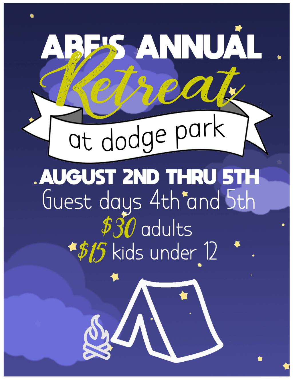
Church Retreat ’19 / Graphic Design
Read more: Church Retreat ’19 / Graphic DesignA church retreat flyer. Hindsight Critiques:When I first made this flyer I was SUPER impressed with myself. It’s a cute idea that evolved from an idea focused around a campsite looking up at the stars. I still think it’s cute, the fonts are good. First thing. I HATE the weird chartreuse color of the word…
-

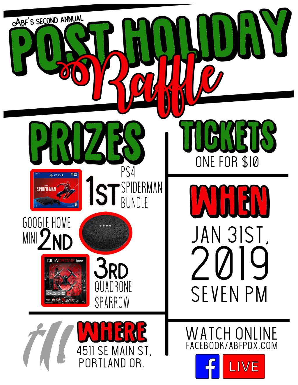
Post-Holiday Raffle ’19 / Graphic Design
Read more: Post-Holiday Raffle ’19 / Graphic DesignThree versions of a flyer I made for a raffle. Hindsight Critiques: First attempt:WHAT IS HAPPENING HERE????? I am not sure where to start. I get the raffle tickets as section headers but the idea is poorly done and there’s no real theme other than that. The background color is atrocious… what color is it?…
-
Church Thanksgiving ’18 / Graphic Design
Read more: Church Thanksgiving ’18 / Graphic Design2 different flyers for the same event. The original (with the black text) was rejected by the higher-ups so I tried with a fresh design. Hindsight Critiques On the original:The background is really distracting. Information is only divided by alternating text, blah. It’s too busy and kind of hard to read. On take 2:Definitely better.…
-

Rummage Sale ’18 / Graphic Design
Read more: Rummage Sale ’18 / Graphic DesignOne of the first flyers I designed. We didn’t end up using it. The idea was something simple to be printed on several different colors of paper. Hindsight Critiques:The font combo is okay, but the different points of information are only separated by the alternating font. The eye isn’t sure where to focus.

